Sunday, October 19, 2008

O D D P A C K A G I N G

While perusing by copy of “Packaging," Volume 2, 1970,
published by Graphis Magazine. I found a few
odd products that don't seem to hold up well today.
For example:

BAD SKUM
Here's a hair product with a name that
doesn't translate to English all too well.
Does the name of the product describe the contents
of the bottle, or the type of consumer who
it would likely benefit?


SKANK VIN
This little wine might be recommended by the
sommelier on your next date with the girl in the
tube top you picked up at the monster truck show.
Subtle hints of tobacco, a perfumy finish, and judging from
the packaging, not too subtle undertones of fish.


SEVER
A whole line of beauty products that promises
the possibility of losing a limb, or worse.
Don't use these while operating heavy machinery.


EMAIL FLASH
Email bogged down?
One spray of this product on your keyboard
and you can send links to funny YouTube
videos as quick as a wink!


LIFE CIGARETTES
This is just nuts!


IBM CIGARETTES
These were designed by none other than Paul Rand
for what would seem some promotional giveaway.
Imagine these all lined up on the table in the boardroom
with the accompanying ashtray and water glass.
Cigarettes are anathema today, but I'm sure that
there's a mid-20th-century-modern nut out there
that would wet his Dickeys if he came upon these
at a swap meet.


Saturday, October 13, 2007

BACK TO THE OLD LPs

SOFT AND WARM

We all want to feel soft and warm, don't we? Kittens are soft and warm, aren't they? A vaseline-on-the-lens photo of a guy with an oh-so-soft mane of radiant hair is soft and warm, too, isn't it? This is what we call metaphor. I think Frank missed out on another metaphor for soft and warm. The steamy package our kitten left in his box.


Sunday, November 12, 2006

GROOVY MOM

In the early 60s My Mom and Dad both studied at
the Portland Art Museum. This was during the build-up
to the Vietnam War and Dad got drafted. To avoid the general
draft, he was helped by one of his teachers into joining the
Coast Guard. While he was in the service, Mom enlisted
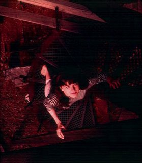
a mutual friend, Fred Lackaff, to take these pictures
as a reminder of the "girl back home".

These are 3D Technicolor stereo slides, only one frame
of each appearing here. Dad had a hell of a time scanning these for me
because they are not in a traditional slide mount, but his
efforts are lovingly appreciated.

These were taken at the Kamm House in Portland,
when Victorian homes were being razed daily.
The Mod-meets-Victorian aesthetic is also apparent in the
window displays previously published herein.


Monday, October 09, 2006

BEARDS

I've been seeing quite a few young groovy dudes in
Silverlake, Echo Park, Eagle Rock and adjoining areas
sporting late sixties to early seventies back-to-earther

beards of late, and I must say, I think it's swell.
Every once in a while designer jeans accompany these
facial hair fashion statements, but, more often than not, we have
home grown, bluegrass loving, grow-your-own,
alternative transportation idealism.

For anyone who wants to reference the source material
for this bearded idealism, I give you two photos from my home town of
Cannon Beach, Oregon taken in the mid 70s.
There is one only graphic T-shirt in the bunch - "I am not a tourist."


These were my friends, my brother's friends and my parent's friends.
This is a community.
Let's all make daisy chains and stop wearing logos.


Sunday, October 01, 2006

MORE GROOVY 60'S FASHION FROM DAD

By request, here are some one column newspaper ads
my Dad, (Kenneth Grant) did during the early to mid 60s.
They tie in with the previously posted window displays.

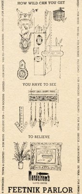
This is an ad for the opening of Nordtrom's new
junior shoe store. My Mom (Barbara Grant)
wrote the copy and came up with the name "Feetnik Parlor."
Note how the various shoe lines running up the sides are
described as being "For Mods," "For Rockers." or "For Swingers."
This is from the era that gave us the name Brass Plum for the
Nordtrom junior men's store, which still exists today.


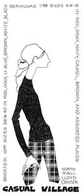
Dad went freelance in the late 60s, doing diplays and ads for several junior
boutiques in the Portland area. Here are a few ads. Skinny was "in".
Again, Dad did the illustrations, Mom wrote the copy and did the lettering.

Footnote: When Dad worked there, one of the shop girls at Clark's
was Portland girl Sally Struthers, later to show up as an actress
on "All in the Family."


Another Clark's one column ad.


Another. This one for a fashion show.
Civil disobedience used to sell swimsuits.

This one wasn't scanned from a newspaper ad,
but the original ad mat. Other than Nordstrom's,
Clark's Junior and Casual Village, Dad worked for
other boutiques with names such as The Blouse Tree
and Glass Butterfly (how psychedelic is that!).


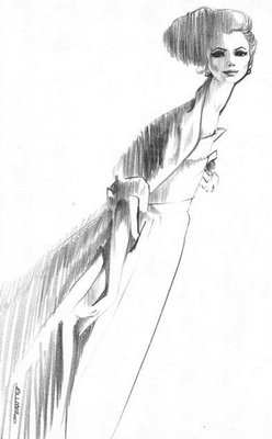
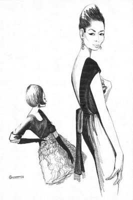
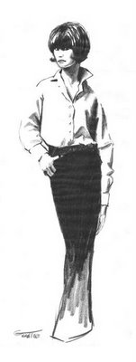
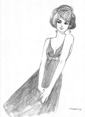
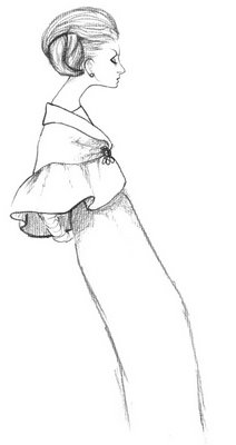
Here are some fashion illustrations Dad did while at the

Advertising Art School in Portland during the early 60s.
He was in his early 20s then. That's where my parents met.

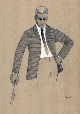
Boy, can he draw! I love the way he renders hands. Very difficult.

Here's the only male of the bunch. Dad used to wear those same
skinny ties and mod jackets to work. I aquired them in the early 80s
when in college and made them a part of my mod fashion repertoire.

Tuesday, September 26, 2006


New topic:
WINDOW DISPLAY

My Dad (Kenneth Grant) was display clown (his term) at
Bedell's Department store in Portland, Oregon in the late '50s
and then at Nordtrom's in Portland in the mid '60s, becoming display manager.
He sent me scans of these slides (actually one half of stereo 3D slides)
which I would like to share. They are pretty groovy.
Unfortunately the scans leave something to be desired.
He always wore a suit to work (with skinny tie, of course)
and crepe soled shoes so he wouldn't mark up the display window floors.


NORDSTROM, MID SIXTIES
Dad's Illustrations and type would be pretty groovy today.


NORDSTROM, MID SIXTIES
Another view.


NORDSTROM, MID SIXTIES
This one is just nuts, but check out the art on the boxes.


NORDSTROM, MID SIXTIES
Campus Casuals. I think the figure is a self-portrait of Dad.
Check out the big suspenders holding up the shoe racks.


NORDSTROM, 1967
The clapboard reads:
Scene: Fall, Take: 1967, Sound: Wild


BEDELL'S DEPARTMENT STORE, LATE FIFTIES
It's hard to see, but the background is Japanese newspapers,
complimented by black origami birds.


BEDELL'S DEPARTMENT STORE, LATE FIFTIES
Before the youth oriented sixties, there was the adult-oriented fifties.


One note: The home town department store is gone.
Those Portland department stores I s
uch as Lipman's
Meier & Frank, Bedell's, etc. have all ben replaced by Macy's.
I hate Macy's.

Friday, August 18, 2006

New topic:
DESIGN LESSONS
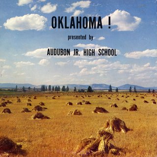
Wherein regular folks get to design an album cover.

This one is a perfect marriage of type and image.
I dare say this cover is much better than the
Original Broadway Cast album released by Capitol,
or any of the subsequent incarnations of this musical play.
Ed Ruscha (Oklahoma native) anyone?

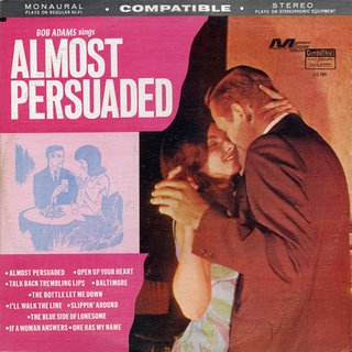
Why did the designer feel that the couple needed to
be represented in two different mediums (stock photography
and clip art). I'm persuaded...almost.

Perhaps the longest album title of all time:
For One In My Life the Mellow Contemporary Now Sounds
of W. V. Grant Jr. with Atlanta's famous Goss Brothers
featuring David Davis at the Hammond.

Poor Mister Davis' name is exactly the same tone of green
as the background. Maybe they didn't like him so much.
A good lesson in mixing up typefaces.

The back reads:
Presenting the NOW God for the NOW Generation

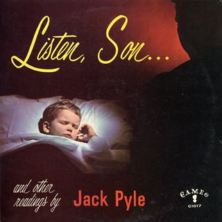
One of the creepiest album covers of all time.
This would never work today,
unless, of course, you were Michael Jackson.
Similar combination of scripts and Gothics as the cover above.